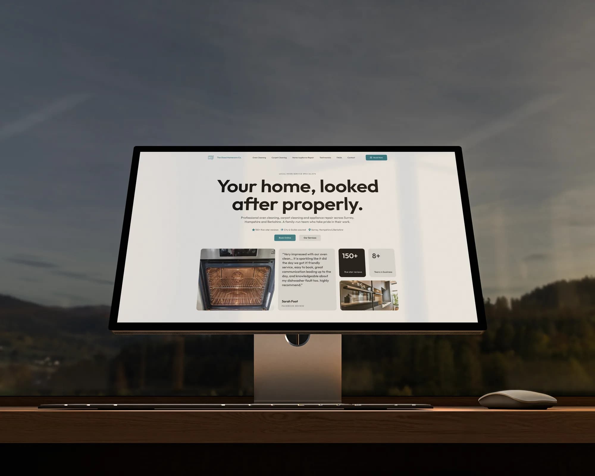
Clonestar Podcast
A podcast website that publishes its own episodes, thanks its patrons by name, and hides a red alert in the footer.
Visit clonestarpodcast.com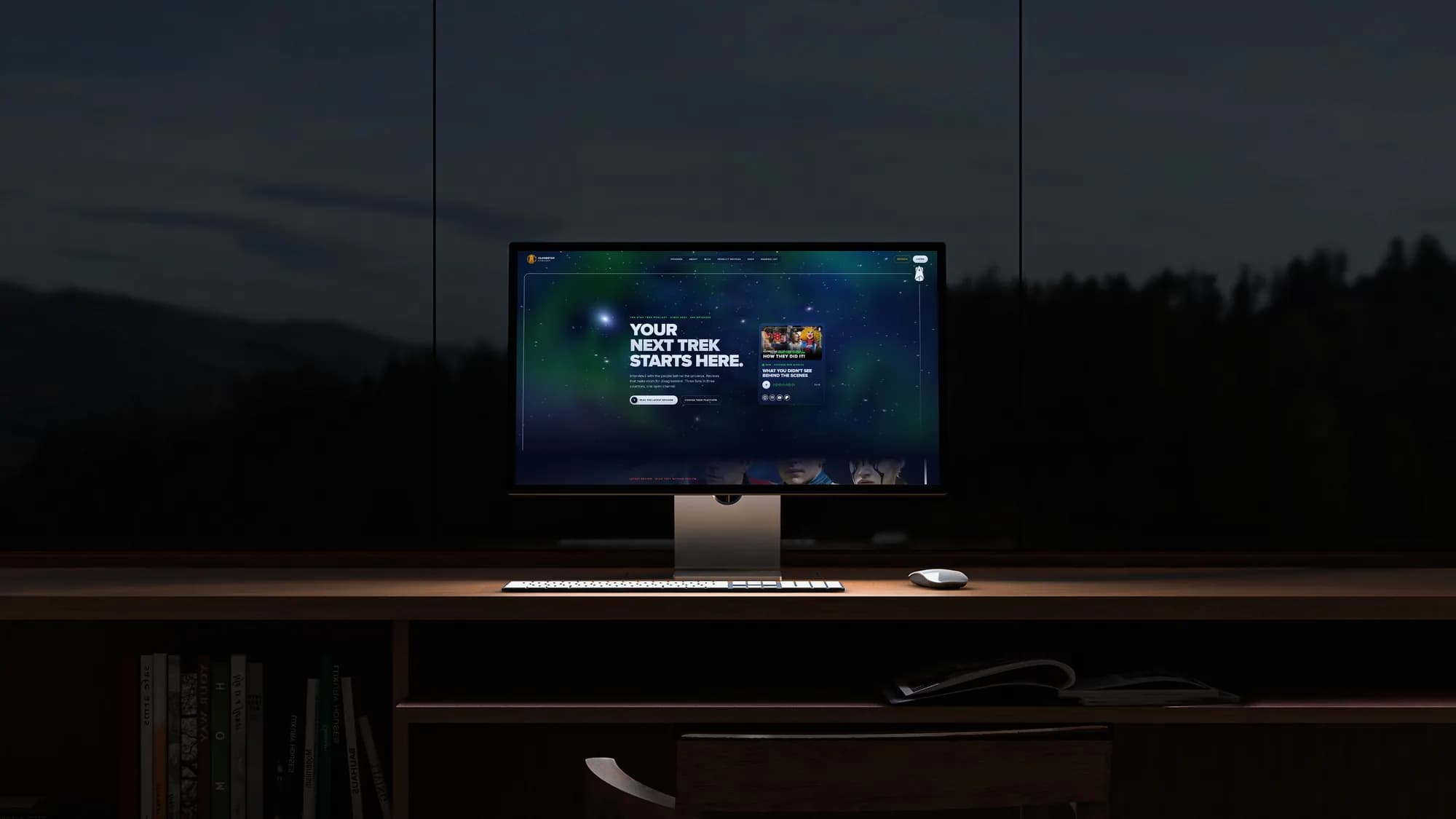
- Location
- UK & Ireland
- Sector
- Podcast
- Year
- 2023 to present
- Services
- Web & Digital, Branding, Graphics, Print
The client.
The Clonestar Podcast began as a passion project between Seosamh Hurley, the self proclaimed greatest fan of Star Trek: The Animated Series, and me, with my remarkable wealth of random Star Trek facts. Nearly 250 episodes later it's a weekly show with interviews, reviews and an audience in three countries. I handle all of the design, and in November 2026 I rebuilt the whole website from scratch.
The old site was WordPress and Elementor: fine to start with, slow to load, and every new episode meant someone logging in. The rebuild had to feel premium, run itself, and respect the people visiting it.
Where it started.
We widened the show's focus early on to include interviews, capturing the stories of people connected to Trek, directly or otherwise. That brought fresh perspectives to familiar ideas and much better conversations. By keeping the atmosphere welcoming, we set out to build a community where listeners enjoy a healthy debate and share their own thoughts.
The brand.
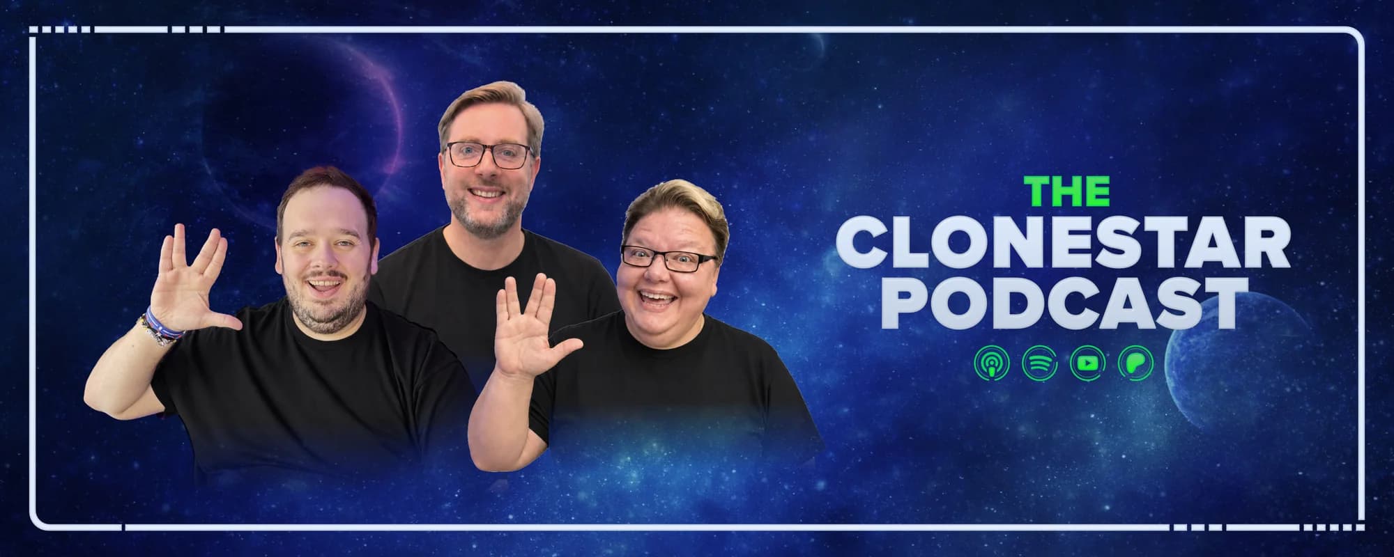
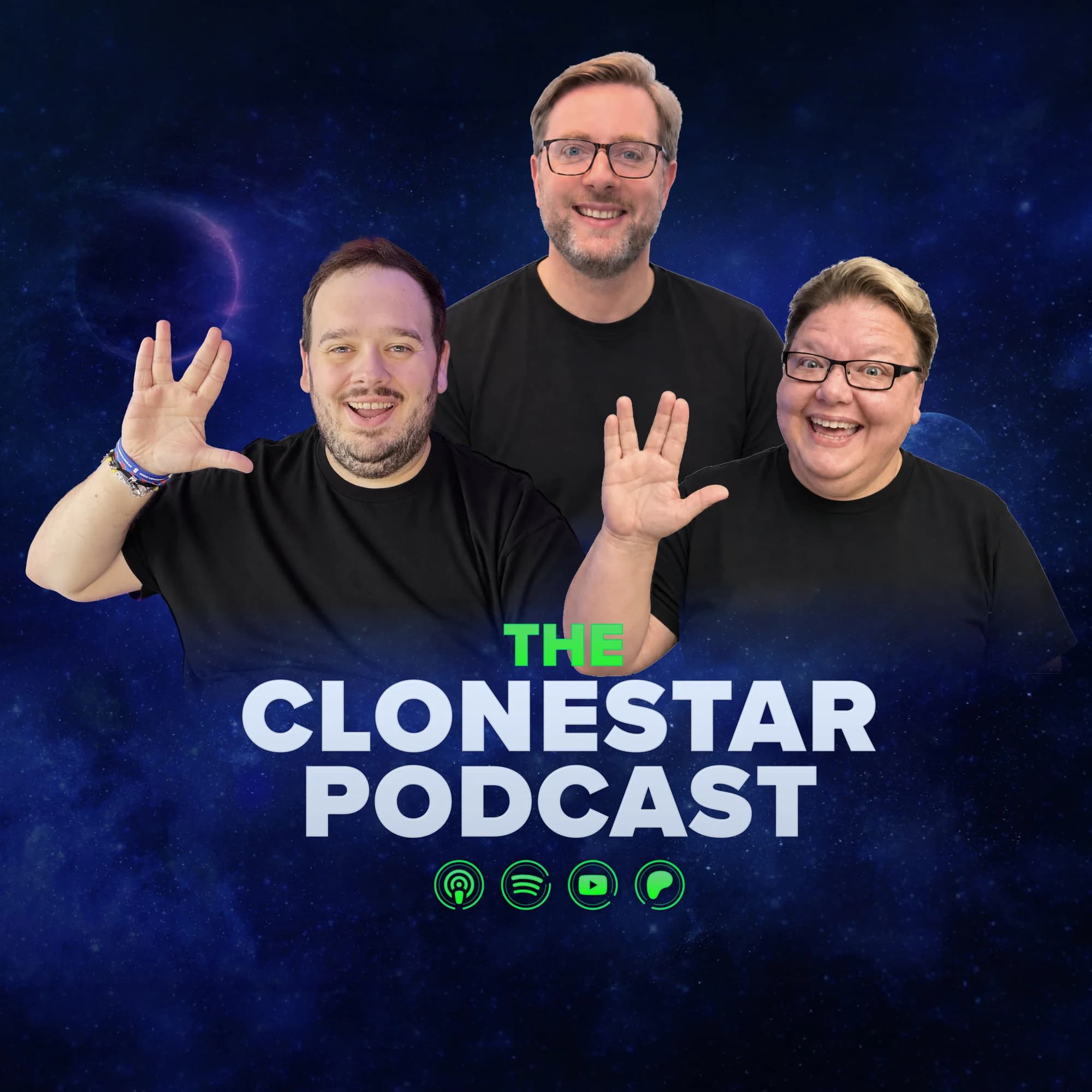
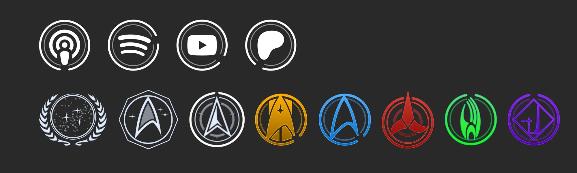
I designed the whole identity: the logo, cover art, banners, YouTube graphics, platform icons and a family of emblems for the Patreon tiers. Everything shares the same deep space backdrop and the broken ring that runs through the logo, so any piece reads as Clonestar straight away, whether it's a thumbnail on a phone or a screen in a convention hall.
The 2026 rebuild started from the brand guidelines rather than the old site, so the identity got a revamp at the same time: Proxima Nova for headings, a deeper space palette, and the emblems promoted from Patreon tiers to a way of navigating the show.
The identity.

The rebuild.
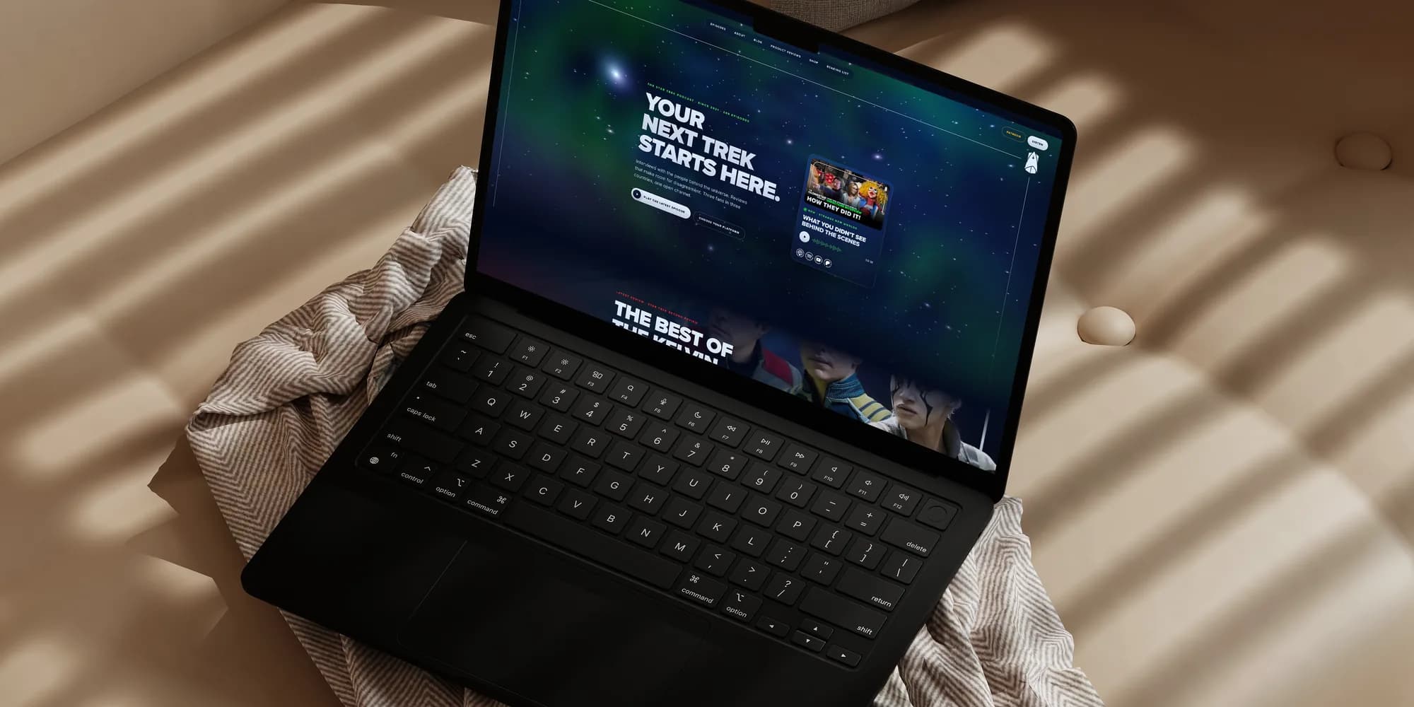
clonestarpodcast.com went from WordPress and Elementor to a fully custom Next.js site. The brief I set myself was a premium feel, the kind of site you'd expect a studio to have charged five figures for. A WebGL starfield, smooth scrolling and reveal animations give it that, without making it slow: the starfield steps aside on devices that can't run it well, and nothing animates unless it's on screen.
The core rebuild went live in a single day, on 9 November, with the polish following over the week after.
The 2026 site.
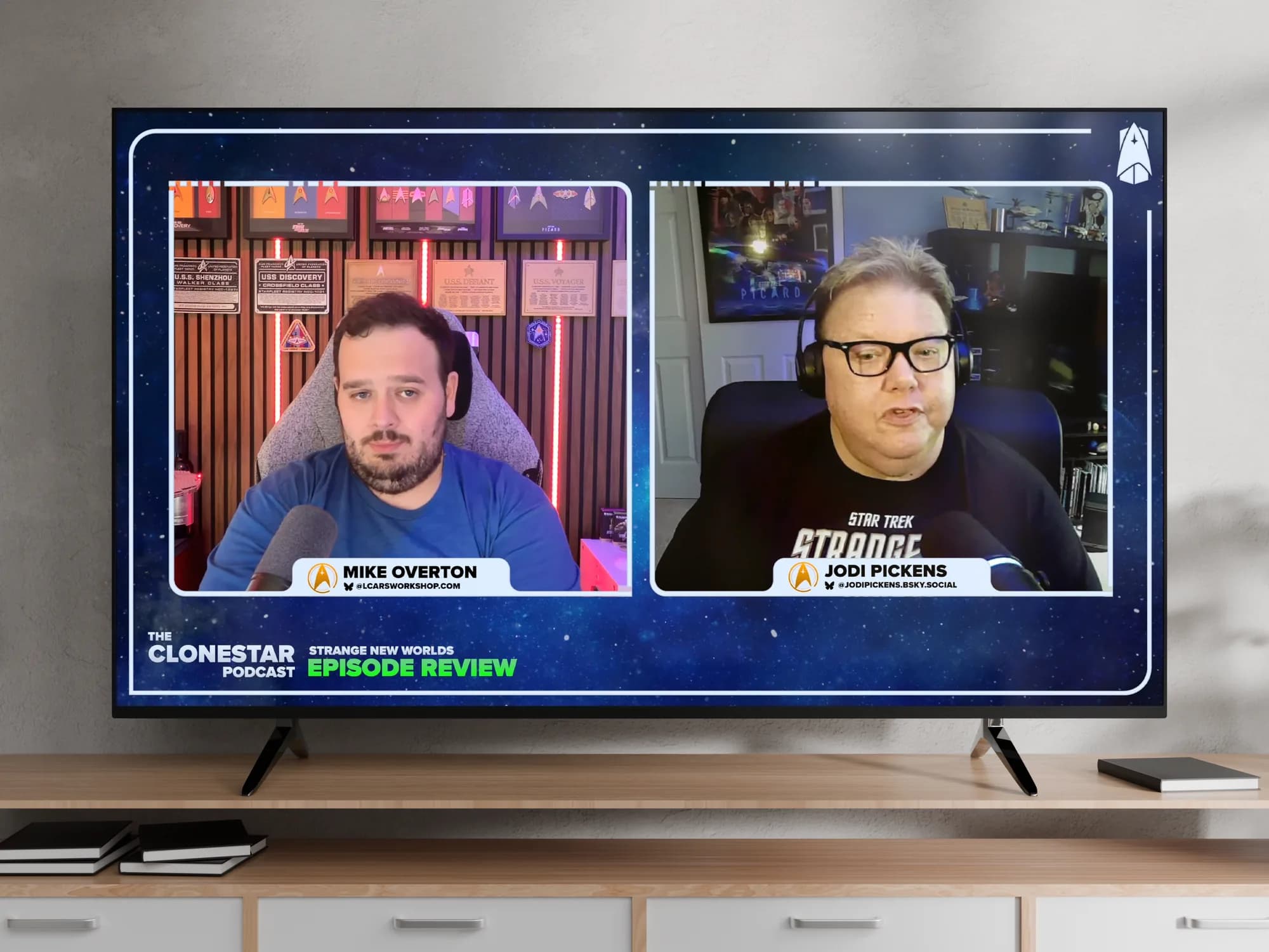
It runs itself.
Episodes come straight from the Clonestar YouTube channel. The site checks hourly, so a new upload appears on its own. Every one of the nearly 250 episodes is on the site, backed by a snapshot of the 227 that existed at launch, so if YouTube is unreachable during a build nothing goes missing.
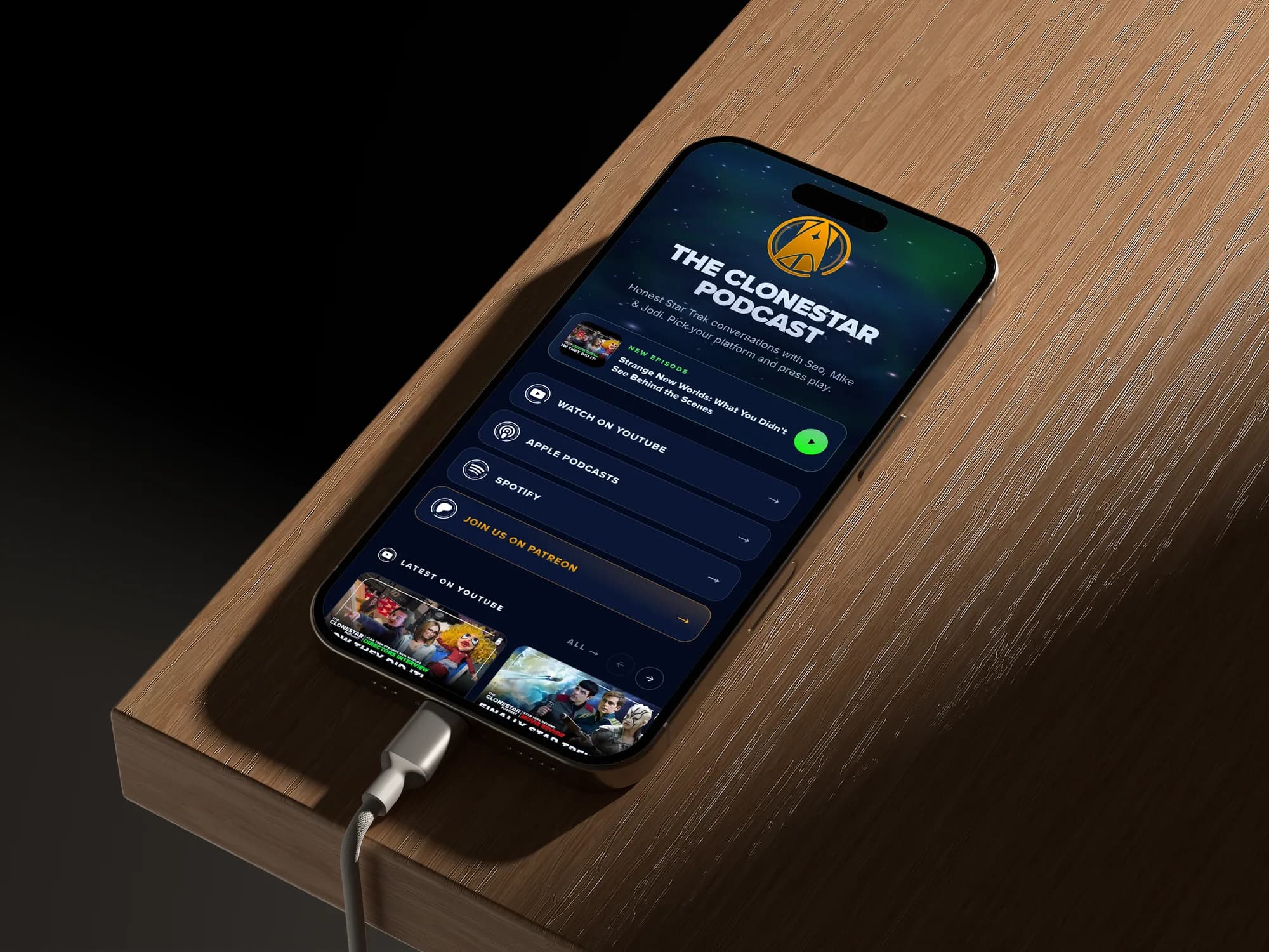
The RSS feed is pulled in too, so audio-only episodes play in the site's own player, and each episode is matched automatically to its exact Apple Podcasts and Spotify link. The links page brings every platform together in one place.
Built for fans.
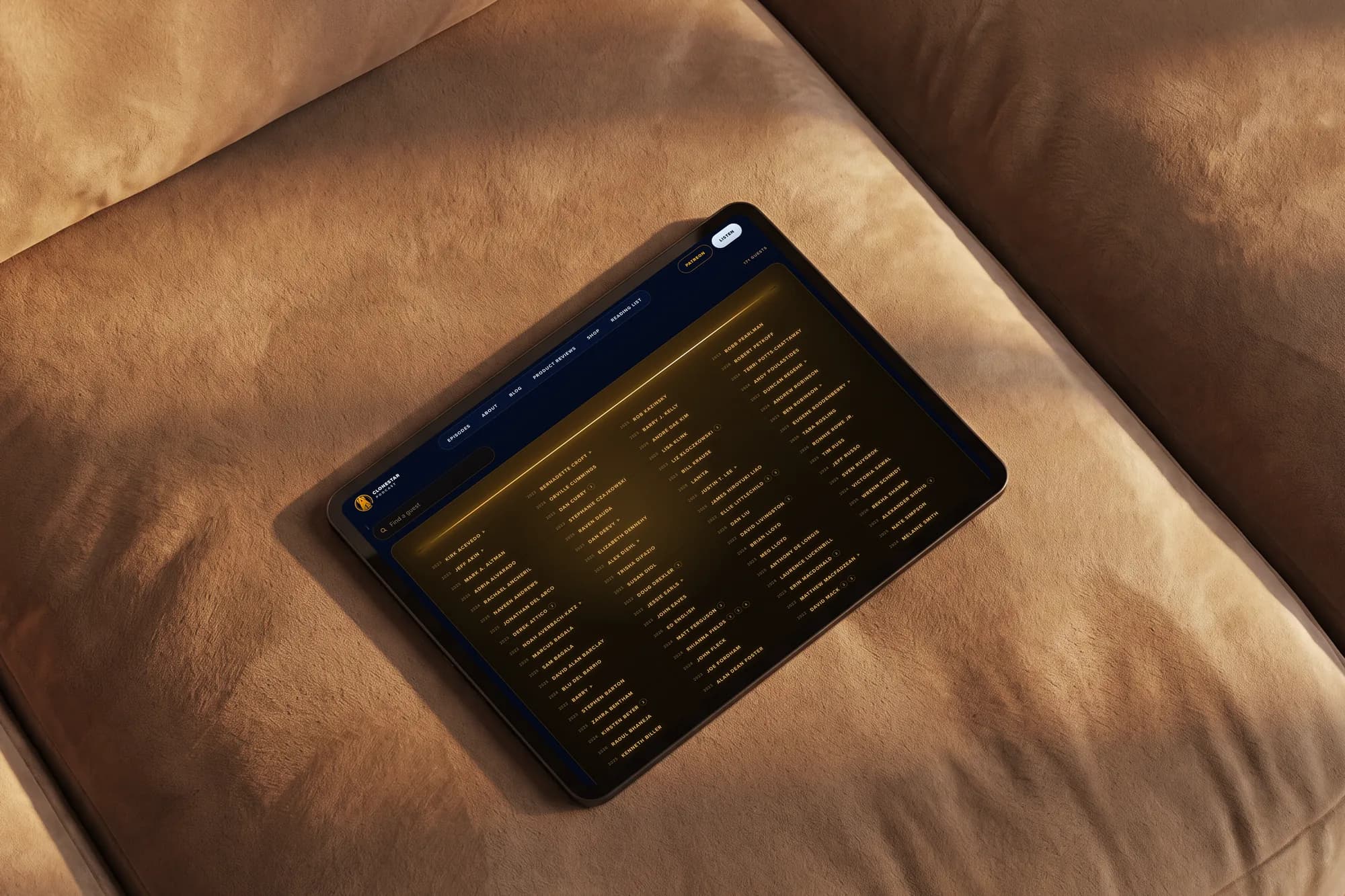
The guest wall is inspired by the Starfleet Academy alumni wall: every guest the show has had, over 170 names, each linked to their episode, with a slow drifting teaser of the names on the homepage. Find your frequency gives listeners different ways into the one podcast, each with its own emblem; those emblems have since become pin buttons in the merch range. The crew manifest thanks Patreon members by name on the homepage.
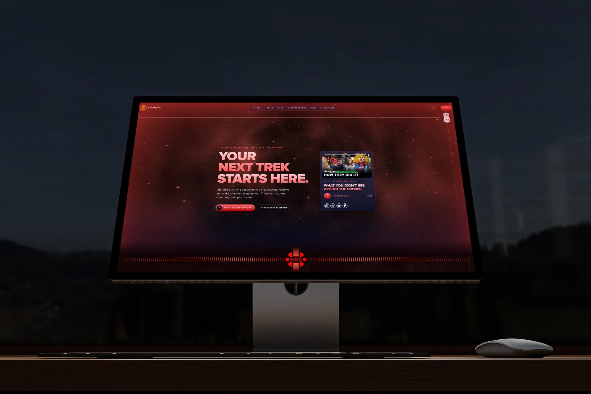
And there's a red alert hidden in the footer. It plays the TNG klaxon, turns the starfield red and slides in an animated LCARS alert banner. Nobody asked for it. Everybody who finds it tells someone.
Privacy and ownership.
Analytics are first-party and cookieless: no IP addresses stored, Do Not Track honoured, old data deleted automatically. Because there's nothing to consent to, there's no cookie banner. A private stats dashboard shows traffic, form enquiries and Core Web Vitals from real visitors.
The contact form has no CAPTCHA. Spam is stopped behind the scenes with a signed token, a honeypot field and a minimum fill time, so a real person never has to find the traffic lights.
Performance and polish.
Mobile and desktop were both tuned against PageSpeed Insights, accessibility issues fixed, and the layouts checked on awkward screens: dual-screen phones, small and short phones, mid-width tablets. Branded social preview images are generated for every page, so a shared episode looks like Clonestar wherever it lands.
Clonestar has grown beyond what we expected into a much loved platform for a loyal audience, a space for healthy discussion and friendly disagreement. The site now matches it: faster than the old one on every measure, nothing to log into, nothing to consent to, and a new episode on the homepage within the hour of it going up.
- Episodes, published automatically
- 250
- Guests on the wall
- 170+
- Day from WordPress to live
- 1